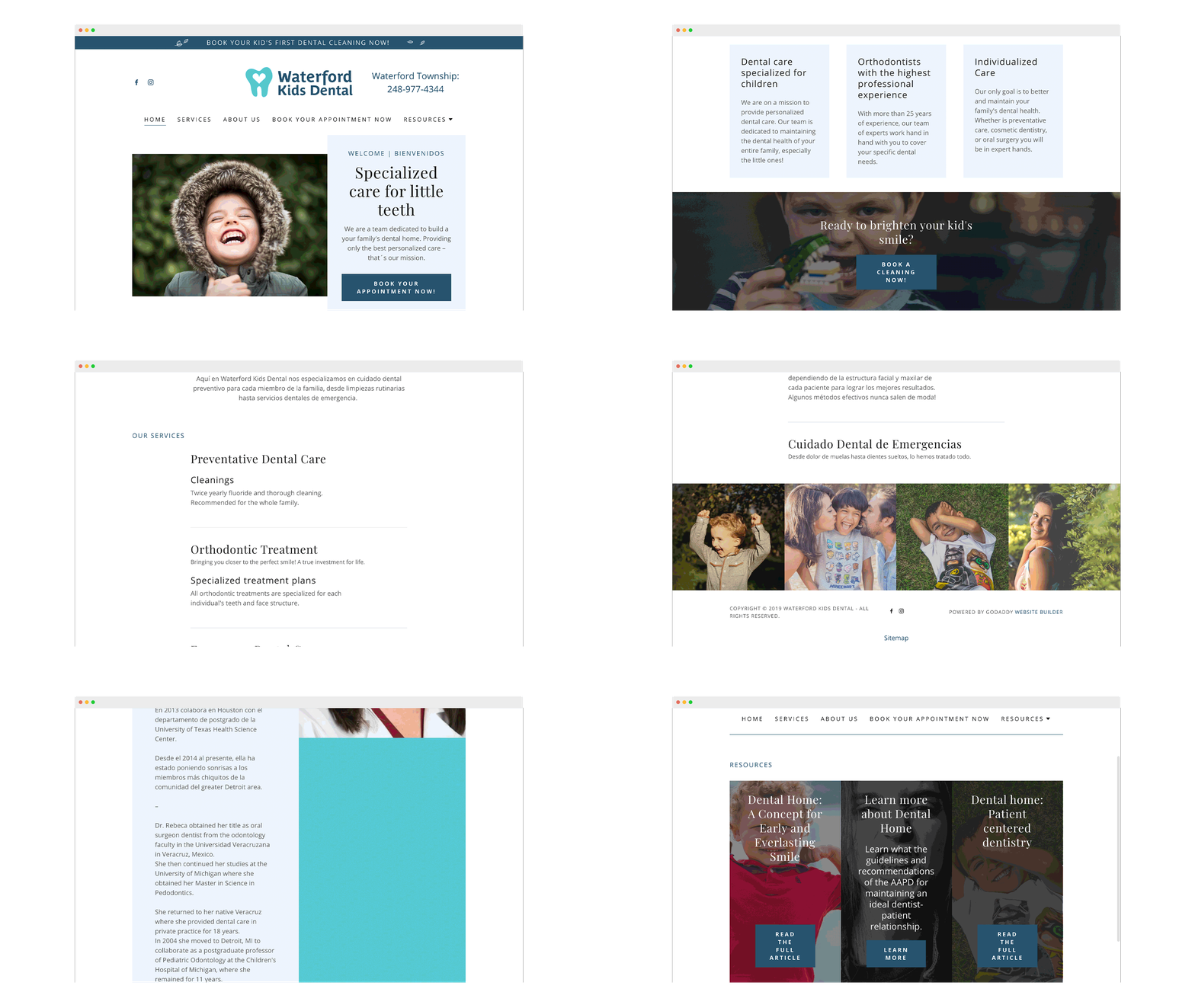
A family dental clinic seeking to break through culture and language to engage new clients with an approachable and friendly brand.
BRAND DESIGN
WEBSITE DESIGN
CONTENT CREATION
PRINT AD DESIGN
STATIONARY
INSTAGRAM FEED
SWAG
Dr. Rebeca is on a mission to create a caring and comfortable dental clinic for families to call their dental home. To her, Waterford Kids Dental needed to have an approachable, friendly brand that could communicate in a casual and helpful voice both in English and Spanish.
WATERFORD KIDS DENTAL
Using the simple outline of a tooth with a heart in its center, the WKD brand was positioned with a friendly and approachable tone and color palette.
Form followed function during the website design. Curating a gallery of free images from unsplash.com we were able to capture happy and healthy smiles that match the inviting and playful tone of the brand.
The content creation took the spotlight on the website. Using relevant keywords, we were able to boost the SEO of the site with only relevant and on-point messaging.
Translating the website content was a challenge of not only translating words but also translating meaning.
Engaging a leading Latino publication Latino Detroit, a set of print ads were created to reach WKD’s target audience. Various sizes for different publications, and different fits depending on the page.
A straightforward letterhead design was also able to be used in the design of intake and referral forms.
Fun “extra assets” that were accumulated during the design process got sprinkled into various print and mobile collateral.
Continuing the playfulness of the brand, the instagram became an experimental continuous scroll, wherein each post on the feed becomes part of a larger, neverending image.
To “get away with” odd imagery, the strategy behind the content in the instagram post captions was essential to convey the needed call-to-action.
Proposed Welcome Bundle included branded pouch, travel toothbrush case, eco-friendly toothbrush, branded floss, and a sticker.


