BRAND DESIGN
UX/UI DESIGN
WEBSITE DESIGN
CONTENT CREATION
VIDEO CREATIVE DIRECTION
DECK DESIGN
SWAG / Other
Bareo’s mission to make food entrepreneurship easier by providing simple, food-specific digital tools became the main driver of the DIY and crafty look and feel of the brand.
BAREO
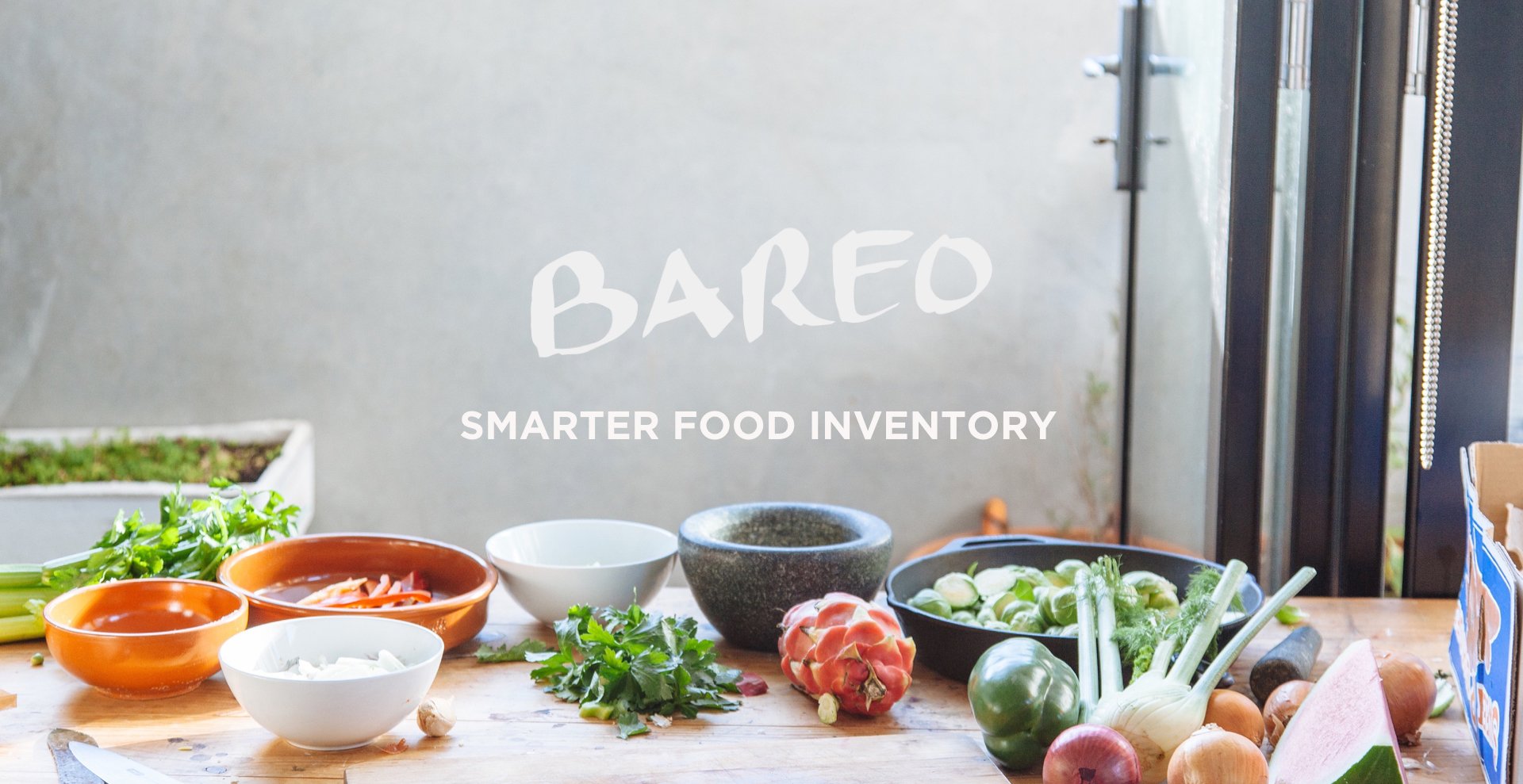
Bareo’s handwritten logo merged the craftiness of food startups with an on-trend color palette and image curation that is familiar in the tech world.
Bareo became an eyecatching app icon on the App Store, cutting through what enterprise software is supposed to look like. Leveraging people’s most used everyday item, Bareo launched as an iOS & web app for inventory on the go.
Bareo featured easy to understand data entry flows and familiar, native iOS aesthetics to make the device a powerful business tool.
Bareo needed thoughtful messaging and content throughout the app, marketing, and communications to convey its ease of use and ability to make running businesses easier.
As part of the friendly, helpful tone of the brand, a demo video was created with the help of Zach Poley to explain how the Bareo app works.
A big part of Bareo’s marketing effort was directed at growing the business. To this end, different versions of a main pitch were created, each with accompanying keynote decks specific to events or investors.


